Beyond Beige: How to Make a Neutral Rug Scheme Feel Rich
Neutral interiors remain the most requested look among our customers, and it is easy to see why. Creams, stones, oatmeals and soft greys are calm, versatile and endlessly liveable. But there is a fine line between serene and bland. The difference almost always comes down to what is happening underfoot.
Texture does the work colour usually does
When you remove strong colour from a room, texture becomes the main source of interest. A rug is the ideal place to introduce it:
- Loop and cut pile together create subtle patterns that change with the light.
- Natural fibres such as jute and sisal bring an organic, slightly rustic contrast to smooth plaster and linen. Our guide to natural fibre rugs explains the differences.
- Hand-woven wool has a gentle irregularity that machine-made rugs cannot quite replicate. Read more in why wool remains the gold standard.
Get the undertones right
Every neutral has an undertone. Some creams lean yellow, some pink; some greys lean blue, others green or brown. Problems arise when a warm oatmeal rug sits against a cool grey sofa: neither looks quite right. Hold your rug choice next to your largest pieces of furniture and your wall colour. Consistent undertones create harmony; mismatched ones create a faint sense of unease you may not be able to name.
Layer tones, not just one shade
The most beautiful neutral rooms use three or four related tones rather than a single beige. A rug a shade or two deeper than the walls grounds the room; a lighter rug lifts it. Adding a darker accent, perhaps a charcoal cushion or a walnut side table, stops the scheme from dissolving into softness.
Consider a quiet pattern
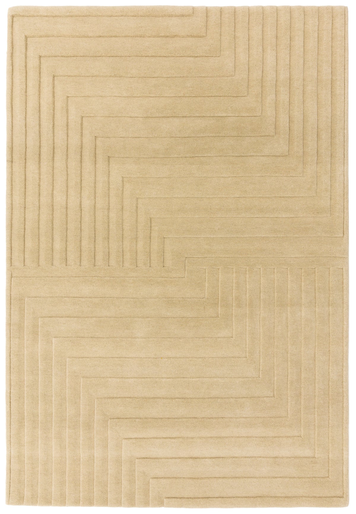
A neutral rug need not be plain. Tone-on-tone designs, faint geometric outlines and softly distressed traditional motifs all add depth without disrupting the calm. They also have a practical advantage: they hide everyday marks far better than a flat, pale colour.
Practical thoughts on pale rugs
Pale neutrals show dirt more readily, so think about where the rug will go. In a busy family room or hallway, a mid-tone stone or mushroom is more forgiving than ivory. Save the palest shades for bedrooms and formal sitting rooms.
A decorator's note
If a neutral room feels flat, the answer is rarely more colour. It is almost always more texture. Swap a smooth, low rug for something with a tactile, hand-crafted surface, such as our Form Natural, and watch the whole room come to life.