Article: Red, Rust and Terracotta Rugs: Warm Colour for the Darker Months
Red, Rust and Terracotta Rugs: Warm Colour for the Darker Months
The clocks go back this weekend, and with them goes the long evening light. It is the point in the year when a room that felt fresh and airy in August can start to look a little cold by five o'clock. Few things change that as effectively as warm colour on the floor. Red, rust and terracotta are the colours of brick, clay, autumn leaves and firelight, and a rug in this family brings a sense of warmth that no amount of extra lamps can quite replicate. Here is how to choose the right shade, and how to live with it. Browse our full range of terracotta and rust rugs.
Understanding the family
"Red" covers an enormous range, and choosing well starts with knowing which part of it suits your room.
- Terracotta and clay are earthy, slightly muted and easy to live with. They behave almost like a warm neutral and sit happily with oak, linen and stone.
- Rust and copper lean towards orange and brown. They are rich and autumnal, and pair beautifully with deep greens and inky blues.
- Brick sits in the middle: warm, grounded and a little more assertive than terracotta.
- True reds and crimson are the most dramatic. They are traditional in Persian and English country schemes, and they decide the mood of a room.
Designs worth knowing
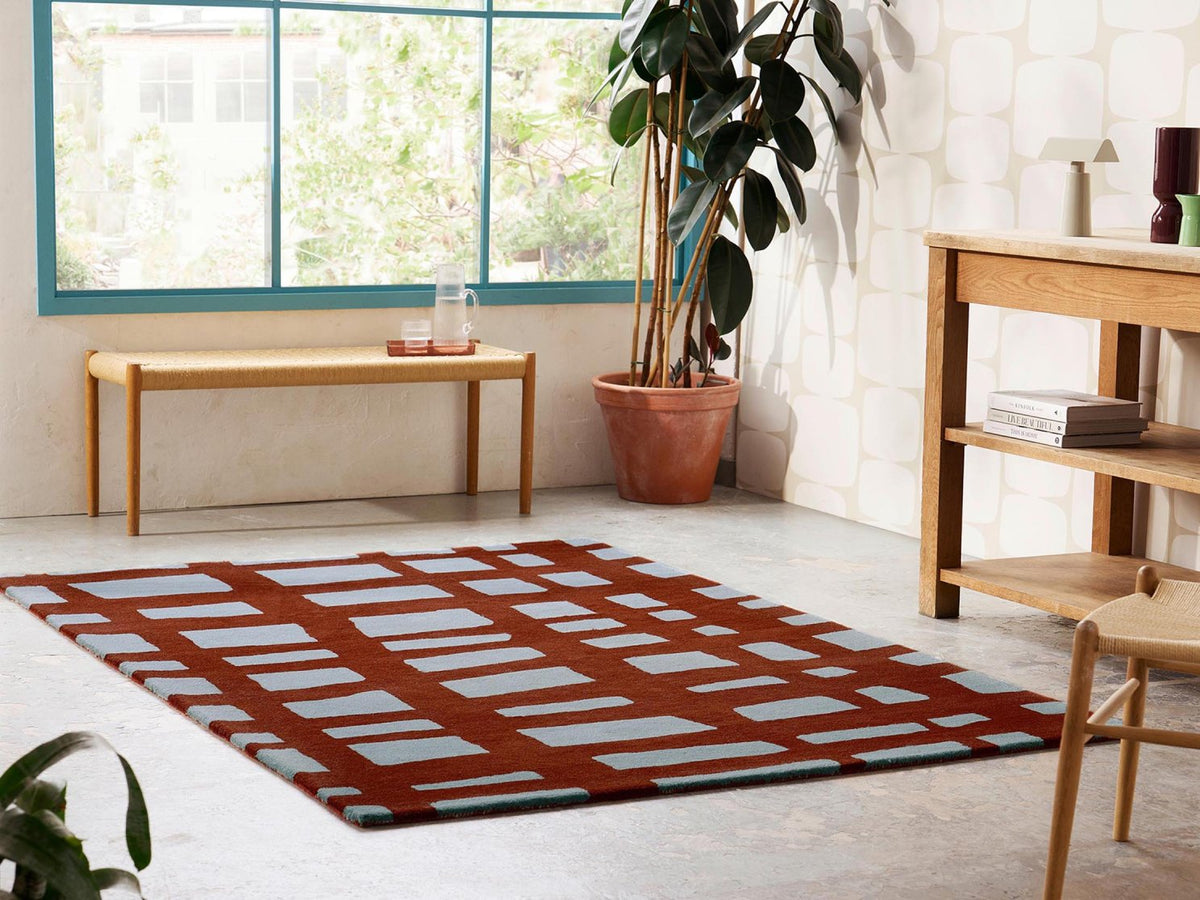
- Scion Arlo is a loose, hand-drawn crosshatch of broad brick-red bands, with soft powder blue in the windows between them. The blue cools the red and keeps it from feeling heavy. See Arlo in Brick. Scion Hatch in Rust takes a more structured approach, with rust squares and bottle-green crosses on ivory.
- Sanderson Poppies draws large-scale poppies at close range in the brightest palette Sanderson have put on a rug. Poppies in Red is the original colourway and works best against plain walls and quiet upholstery.
- Sanderson Rose & Peony is one of Sanderson's most beloved designs. In Red, the blooms are carried in deep crimson and rose on a warm ground, with high cut pile and loop pile combined so the flowers stand proud.
- Katherine Carnaby Chrome is the plain option: hand woven in 100% viscose with a thick 12 mm silky pile. Chrome in Paprika brings warm colour and lustre without any pattern at all.
- Traditional reds include Laura Ashley's Wendling Floral in Poppy Red, an archive chintz of roses, carnations and chrysanthemums, and the Persian-inspired Vintage Kashan in Red, with its bordered, distressed look.
How to style a warm-coloured rug
Let the rug be the warmth. If the floor carries the colour, the walls and larger furniture can stay calm. Off-white, putty, stone and soft grey walls all let a terracotta or rust rug glow without the room feeling overheated.
Pair it with green or blue. Red and green are opposites on the colour wheel, and a rust rug with an olive sofa or deep green walls is one of the most satisfying combinations in interiors. Blue does a similar job more quietly, which is exactly what the powder blue in Arlo achieves. Our guide to living with green rugs explores the other side of the pairing.
Add brown and natural materials. Walnut, leather, rattan, jute and aged brass all sit naturally with warm reds. Our piece on styling chocolate, tobacco and caramel shows how far that tonal palette can go.
Repeat the colour once or twice. A cushion, a lampshade or a print that picks up the rug's red ties the scheme together. Two or three echoes are plenty.
Think about the light
Warm colours shift more than most as the light changes. In a north-facing room, a terracotta that looked soft in the showroom can read browner and deeper; in a south-facing room, a bright red can feel very strong at midday. Look at samples or photographs at different times of day, and if your room is dim in winter, lean slightly lighter and warmer than you think. Our guide to how light changes a rug's colour explains why.
Where warm colour works hardest
- Living rooms and snugs, where evenings are spent and firelight or lamplight brings out the depth of the colour.
- Dining rooms, where red has a long tradition and a patterned design is forgiving of dropped crumbs.
- Hallways, where a rust or brick runner is welcoming on a grey day and hides the marks of muddy boots better than a pale one.
- Studies and libraries, where warm reds suit dark wood, leather and books.
A decorator's note
Red is the colour clients are most nervous about, and the one they are most often delighted by. The trick is to choose the shade by the room rather than the swatch: look at it alongside your floor, your sofa fabric and your wall colour, in the light you actually live in. If you would like a second opinion, send our team a photograph of your room and we will happily suggest the warm tones that will suit it best.